Vuetify Tutorial: How To Create Cards
Vue.js
02/01/2021
Cards are a wonderful way to group together related content, no matter if on the web, your mobile phone or computer. Actually, once you start watching out for them, you will realize that they're everywhere! 🤯 As such, knowing how to create them will serve as an indispensable tool in your arsenal. That is why in this Vuetify tutorial, I'll show you how to create cards.
The layout
A card in Vuetify is made up of five different components: v-card, v-card-actions, v-card-subtitle, v-card-text and v-card-title. Let's take a look at each one on its own.
The container
As the name implies, v-card serves as the body of your card, which gives it that distinctive card look. Technically, you could do without the other components and call it a day. 😂

As with all Vuetify components, it's very customizable. The main way to customize components is through props. For the newbies among you, it's basically a custom CSS attribute with it's own value. One example can be seen below:
<v-card id="card-1" elevation=4 outlined shaped> <p>This is an empty <code>v-card</code> with some props styling </p></v-card>

Here, we are passing 3 different props: elevation, outlined and shaped. The first receives a number value of 4. The latter two, while we don't explicitly pass values to them, are the equivalent of outlined=true and shaped=true. Be sure to keep that in mind whenever you see that. 🤓
By the way, any examples I show you throughout the tutorial can be played around with in CodePen. Have fun!
How to read Vuetify documentation
Now that you know what props are and how they're inserted into the code, reading the documentation will not be such a challenge. Let's take a look at the documentation in the context of our previous examples.

Squinting your eyes won't make this bigger 😅
The first column is the name of the props, nothing difficult here. The second column defines the value type that is to be passed into the props. outlined and shaped both receive boolean values, so either true or false. On the other hand, elevation can receive either a number or a string, i.e. a string that contains a number. So doing elevation=4 or elevation="4" has the same effect.
The third column shows the default value of each props. This simply means, if you haven't inserted that specific props yourself onto the component, it will use the default value. As an example, <v-card> without any props would use the default values of all its possible props. Basically the equivalent of the code below:
<v-card active-class=undefined append=false color=undefined>// ... etc</v-card>Last but not least, there's the last column. This one has a... description of the props. 😆 Not much else to say here, am I right?
The text
When it comes to writing text in your cards, v-card-subtitle, v-card-text and v-card-title are your go-tos. However, there's not too much to tell y'all here besides the basic theme styling 🎨 being applied to each component. There aren't even any props to use! It should go without saying that these components can only be placed in a card component.
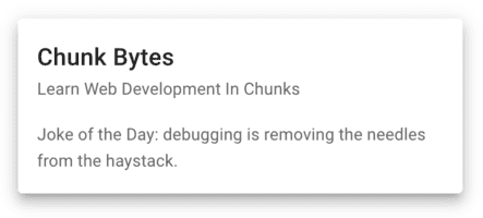
Here's an example of these components in a card. Don't forget, you can play around with the code in this CodePen example.
<v-card> <v-card-title>Chunk Bytes</v-card-title> <v-card-subtitle>Learn Web Development In Chunks</v-card-subtitle> <v-card-text>Joke of the Day: debugging is removing the needles from the haystack.</v-card-text></v-card>

The action section
The final component on our list is v-card-action. This is where the action happens 💥 and users interact with your card through buttons, such as v-btn or v-menu. However, you may of course place non-interactive components like v-icon if you feel like a real rebel. 😎
As with the text components, this one can't be customized either. Instead, it serves to apply some basic styling, such as resizing and alignment.
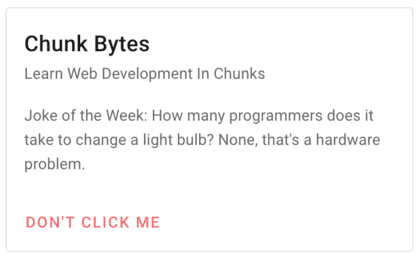
Once again, let's take a look at an example!
<v-card outlined> <v-card-title>Chunk Bytes</v-card-title> <v-card-subtitle>Learn Web Development In Chunks</v-card-subtitle> <v-card-text>Joke of the Week: How many programmers does it take to change a light bulb? None, that's a hardware problem.</v-card-text> <v-card-actions> <v-btn color="red lighten-2" ripple text> Don't Click Me </v-btn> </v-card-actions></v-card>

Adding some basic spacing
While we're at the topic of v-card-actions, let me quickly show you a simple way to space your components. Everybody... meet v-spacer! 💃 It's a Vuetify grid component that takes up as much space as possible in a row without pushing other components out of view or in a new line. In case you didn't know, v-card-actions and v-card-title are based on Flexbox, which is why we can use it!
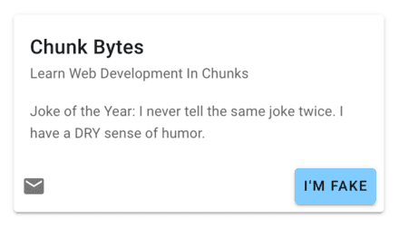
In this example, we place v-spacer in the middle and push components on either side away.
<v-card hover> <v-card-title>Chunk Bytes</v-card-title> <v-card-subtitle>Learn Web Development In Chunks</v-card-subtitle> <v-card-text>Joke of the Year: I never tell the same joke twice. I have a DRY sense of humor.</v-card-text> <v-card-actions> <v-icon>mdi-email</v-icon> <v-spacer /> <v-btn color="blue lighten-3">I'm fake</v-btn> </v-card-actions></v-card>

Overriding styles
On a final note, while you may not have any options to style the v-card-... components through props, you may still override their default styles using classes.
For example, 💁 we could override the default styling of v-card-title by inserting a class .text-h2. This doesn't actually turn it into an h2 tag, but simple gives it that styling.