How To Create A Triangle In CSS
CSS
04/09/2021
There are 2 main ways to create a triangle in CSS: using borders or a clip path.
Borders
This method is the most battle-tested and enjoys support among virtually all browsers. Here's how it's done: Pick an element,
<div class="triangle"></div>and apply a thick border to each side using a different colour. 🎨
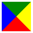
.triangle { width: 0; height: 0; border-bottom: solid 50px red; border-top: solid 50px green; border-left: solid 50px blue; border-right: solid 50px yellow;}

Doing this, you get 4 triangles! The key is to have a collapsed element, i.e. no width or height. Of course, you only want 1 triangle to be visible, so you simply make the others transparent. Let's go for the green one! 🟢
.triangle { ... border-bottom: solid 50px transparent; border-top: solid 50px green; border-left: solid 50px transparent; border-right: solid 50px transparent;}

Clip Path
Syntactically, clip-path is easier to write and maintain. However, it's support in older browsers may be lacking.
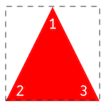
The polygon geometric shape takes any amount of arguments. Each argument 💬 represents a corner of your shape and takes 2 values: x and y.
- X: x coordinate starting from the left to the right of the element
- Y: y coordinate starting from the top to the bottom of the element
.triangle { width: 100px; height: 100px; background-color: red; clip-path: polygon(50% 0, 0 100%, 100% 100%); /* polygon(1[x y], 2[x y], 3[x y]) */}

The coordinates may be expressed in any unit, e.g. %, px, em, etc. I recommend checking out this awesome Clip Path generator whenever you wish to create a shape using clip-path.
